


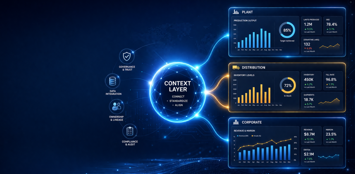
Consumer packaged goods companies operate across fragmented networks: manufacturing plants, distribution centers, regional sales offices, and corporate headquarters. Each location generates analytics independently. Reports multiply. Dashboards duplicate. Ownership becomes unclear.
When someone needs a production metric or inventory visibility across distribution points, finding the right report becomes a maze.
The business impact is measurable. According to SR Analytics research, CPG brands using data analytics achieve 69% higher revenue and 72% cost reductions compared to peers. But that advantage only materializes when analytics are governed, discoverable, and trustworthy.
But governance alone is not enough.
The real challenge is context.
Most organizations already have the data and even the definitions. What is missing is a way to make that meaning consistent across plants, regions, and teams and usable by AI.
This is where analytics governance evolves into a context layer.
Analytics governance manages reports, dashboards, and KPIs.
A context layer connects them – linking metrics, definitions, and business domains into a single, governed understanding of performance.
Your company uses Tableau in manufacturing, Power BI in supply chain, and SAP Analytics Cloud at corporate. Each plant operates independently. Reports multiply.
When teams cannot find the right report, they build their own.
Governance creates a single source of truth by cataloging assets and establishing ownership.
But a catalog alone is not enough.
It tells you what exists.
It does not tell you how metrics relate across plants, regions, and functions.
That requires a context layer.
FDA regulations (FSMA) and internal audits require traceability.
Auditors ask:
Governance provides audit trails.
A context layer ensures those KPIs are consistently defined across the organization — not just documented, but aligned.
A CPG company with multiple plants and distribution centers needs unified visibility into production, inventory, and fulfillment.
But each plant defines metrics differently.
Governance provides access.
Context ensures consistency.
Without context, the same KPI like “production output” cannot be reliably compared across plants.
Corporate teams drive strategy. Plant teams drive execution.
Without governance:
Without context:
Governance organizes analytics.
Context aligns the business.
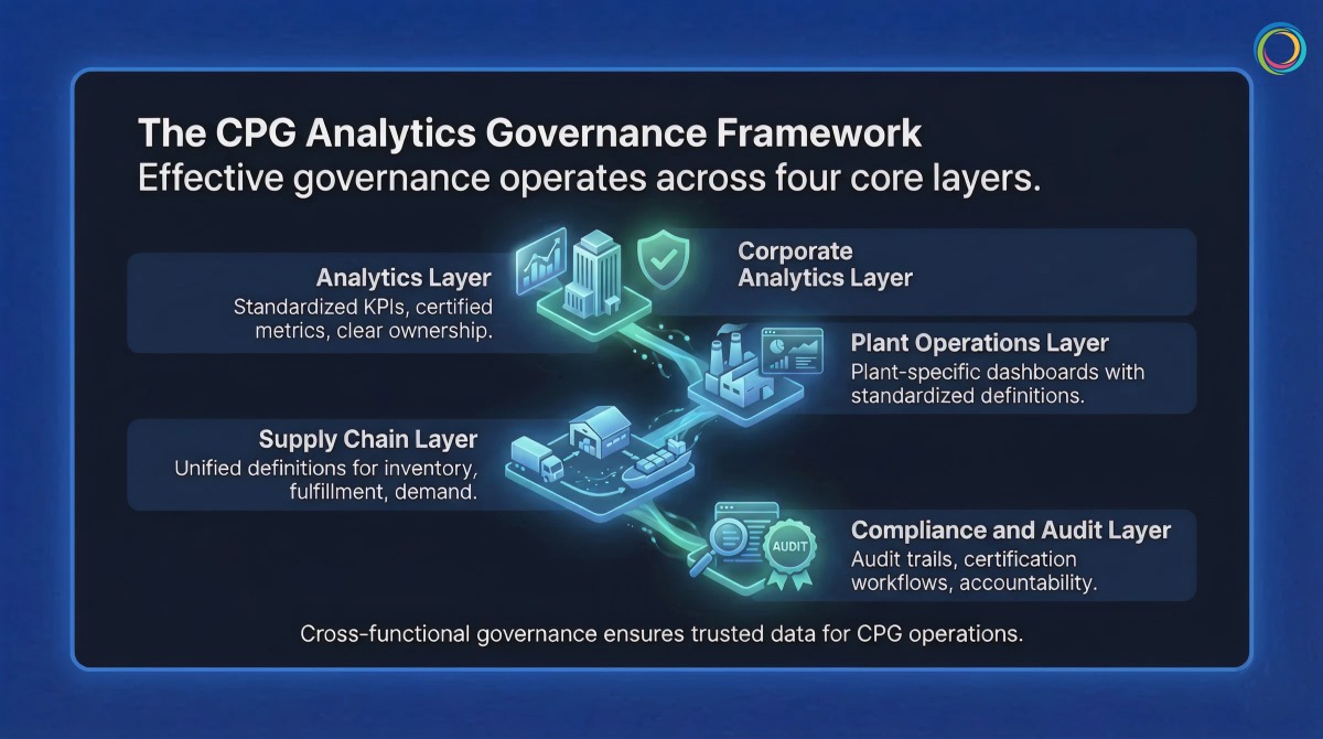
Effective governance operates across four layers:
A context layer ensures that “margin” or “revenue” means the same thing across all reports and tools.
Plant-specific dashboards with standardized definitions.
Context ensures comparability across plants.
Unified definitions for inventory, fulfillment, and demand.
Context ensures alignment across systems and regions.
Audit trails, certification workflows, and ownership accountability.
Context ensures traceability is meaningful, not just documented.
Brown-Forman unified 4,000+ users across BI tools:
Bimbo Bakeries USA:
Both proved the same thing:
– Governance is not about replacing tools
– It is about making existing tools work together
Traditional governance stops at cataloging.
ZenOptics Atlas builds the foundation:
But CPG enterprises need more than a catalog.
They need context.
“Revenue per case” may differ by plant.
“Production output” may vary by region.
A catalog shows reports.
A context layer explains meaning.
ZenOptics Nexus builds this context layer by:
This creates a knowledge graph of your business.
As organizations deploy AI for demand forecasting, production planning, or compliance, this context layer ensures AI understands the business not just the data.
Atlas catalogs.
Nexus contextualizes.
Together, they make analytics:
Catalog all reports and KPIs across plants and corporate.
Assign owners and certify trusted assets.
Create role-based portals for plant, supply chain, and corporate teams.
Track usage, eliminate duplication, and build the context layer that maps relationships across metrics and business domains.
Q: Does analytics governance require us to migrate from Tableau or Power BI?
No. Governance works with your existing tools. It sits on top, creating a unified discovery and access layer.
Q: How long does it take to implement governance across multiple plants?
Most organizations see early results within 4–6 weeks, starting with inventory and ownership.
Q: How deoes the context layer help with AI adoption in CPG?
AI systems need to understand how your business defines metrics.
The context layer standardizes definitions and maps relationships between analytics assets – ensuring AI outputs align with how your organization actually measures performance.
Power BI now serves over 35 million monthly active users across 550,000 organizations. At that scale, the same self-service capability that drives adoption creates a governance problem: workspace sprawl, duplicated datasets, inconsistent access controls, and license costs that grow faster than the value they deliver.
This guide provides a practical framework for governing Power BI at enterprise scale, from workspace structure and dataset ownership through usage monitoring and cost optimization. For organizations operating Power BI alongside other BI tools, it also addresses how unified analytics governance eliminates the overhead of managing separate governance processes per platform.
Power BI’s low barrier to report and workspace creation accelerates adoption, but without governance guardrails, it also accelerates analytics sprawl. Enterprise Power BI environments commonly face five compounding challenges.
Workspace proliferation. Users create workspaces without a provisioning process, naming convention, or lifecycle policy. IT lacks cross-workspace visibility and has no efficient way to identify dormant or redundant workspaces.
Dataset duplication. When business users cannot find certified shared datasets, they build their own. This creates duplicate data pipelines, conflicting metric definitions, and unnecessary compute costs.
Row-level security gaps. Implementing RLS across dynamic security rules at enterprise scale requires coordination between data engineers, Power BI developers, and security teams. Incomplete or untested RLS creates audit risk and unintended data access.
License and capacity cost opacity. Power BI licensing spans per-user licenses, Premium capacity, Fabric capacity, and embedded licenses. Without asset-level usage correlation, organizations overspend on capacity for content that is rarely consumed.
Access control fragmentation. Power BI’s native sharing model (workspace roles, sharing settings, security groups) produces inconsistent access patterns when workspaces span business units and geographies. Compliance audits regularly surface unexpected access, and remediation requires manual investigation across each workspace.
Effective Power BI governance spans five layers, each with distinct stakeholders and enforcement mechanisms.
Workspace governance. Establish a provisioning process with a request form, approval workflow, and naming convention. Define workspace lifecycle policies: workspaces with no activity for 12 months are flagged for archival. Limit workspace admin assignments to maintain consistency across the environment.
Dataset architecture and ownership. Adopt a semantic layer architecture: a small number of certified shared datasets feeding multiple reports. Assign ownership, documentation requirements, and update schedules for every shared dataset. Track dataset lineage to enable impact analysis before changes.
Report certification. Require every report to have a single owner. Use Power BI’s Endorsement features (Promoted and Certified badges) to signal trustworthiness. Establish an archival process for reports with no usage in six months.
Access control and RLS. Use Azure AD groups for workspace access rather than individual licenses. Test RLS rules in development environments before production deployment. Document every RLS rule with the business case and approval chain.
Usage monitoring. Extract consumption data from Power BI Admin portal APIs. Correlate usage to cost: identify which datasets are compute-expensive and rarely used. Track adoption metrics (reports opened per user per month, time-to-discovery for new users) and review quarterly.
ZenOptics Atlas operates across all five layers as the analytics system of record. It connects to Power BI through native connectors, automatically ingesting workspace, dataset, and report metadata. Atlas catalogs every Power BI asset with certified ownership, lineage tracking, and usage visibility, eliminating the manual catalog maintenance that causes governance programs to degrade over time. Portal Pages surface certified content through department-specific landing pages, reducing time-to-discovery and driving user adoption toward trusted reports.
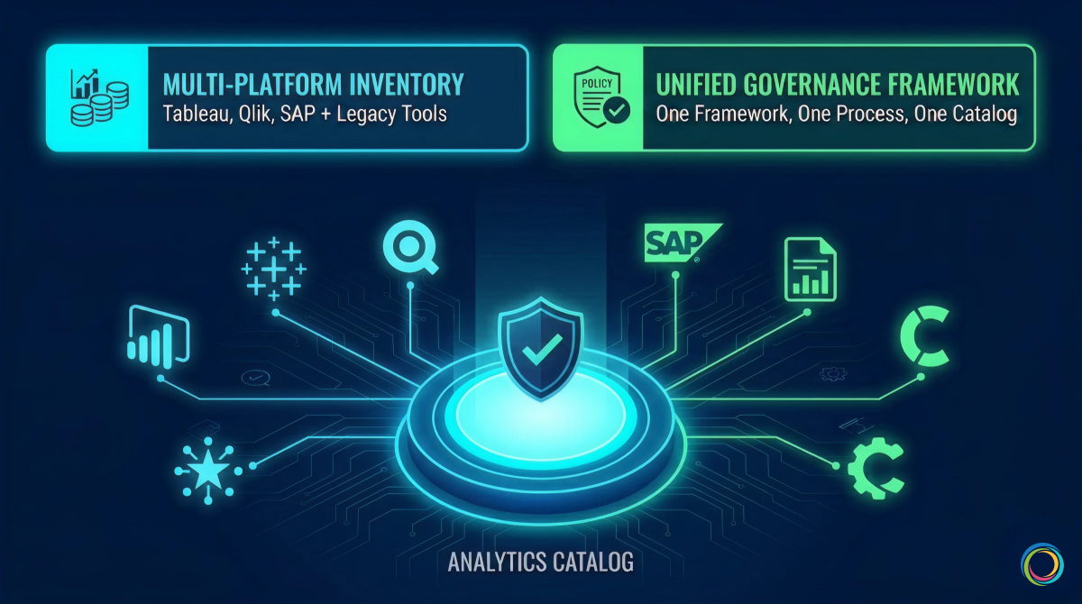
Most enterprise Power BI deployments do not exist in isolation. Large organizations routinely operate Power BI alongside Tableau, Qlik, SAP Analytics, or legacy tools like SSRS and Cognos. Each platform has its own governance model, access control mechanisms, and metadata schema. This creates a compounding governance problem that single-tool governance cannot solve.
Without a unified governance layer, organizations maintain separate governance processes per tool. Policies diverge. The same report exists in both Tableau and Power BI because users cannot discover the authoritative version across tools. License costs are tracked per platform, making total BI spend invisible.
Atlas solves this by inventorying analytics assets across all BI tools in a single Analytics Catalog. One governance framework, one certification process, one access request workflow applies regardless of platform. Usage tracking across tools identifies cross-platform duplicates and rationalization opportunities that remain invisible when governance operates in tool-specific silos.
Brown-Forman unified 4,000+ users across their multi-tool BI environment, achieving a 30% report reduction and 27% analytics adoption increase year-over-year through cross-tool visibility and usage-based rationalization.
Power BI governance does not require a large upfront investment. Start narrow and expand.
Months 1 to 3 (Assessment). Inventory all Power BI workspaces, datasets, and reports. Map stakeholders: workspace admins, dataset owners, report developers. Document current governance practices and identify the highest-friction pain points. Atlas accelerates this phase by ingesting all Power BI metadata automatically, providing a complete inventory and usage baseline within weeks.
Months 2 to 4 (Framework). Define governance policies for workspace provisioning, dataset certification, report ownership, and RLS standards. Establish a BI Glossary for standardized metric definitions. Document policies in a governance charter that serves as the single reference for all governance stakeholders.
Months 4 to 6 (Pilot). Pilot governance policies with one business unit (Finance and Marketing are common starting points because they have clear data boundaries and compliance sensitivity). Collect feedback from workspace admins and report consumers. Adjust policies based on real-world friction before scaling. Train workspace admins on consistent enforcement.
Month 6 onward (Scale). Roll out governance organization-wide. Expand to multi-tool governance if running Power BI alongside other platforms. Optimize based on quarterly usage reviews: retire low-value content, promote high-engagement reports, and right-size capacity allocations based on actual consumption patterns.
Governance success is measured by business outcomes, not compliance checklists alone.
| Metric | Target | Why It Matters |
|---|---|---|
| Workspace utilization rate | > 85% active | Unused workspaces are candidates for archival |
| Dataset reuse ratio | > 3 reports per shared dataset | High reuse signals a healthy semantic layer |
| Report certification rate | > 70% | Higher certification drives user confidence |
| Time-to-discovery | < 1 week for new users | Governance should reduce discovery friction |
| RLS compliance rate | 100% for sensitive datasets | Critical for audit readiness |
| Cost per active user | Trending downward | Direct measure of governance ROI |
For a broader framework that positions Power BI governance within organizational analytics maturity, see The Analytics Governance Maturity Model.
For a pre-migration audit methodology, see How to Audit Your BI Environment Before a Migration.
Atlas connects to Power BI through native connectors that pull workspace, dataset, and report metadata via Power BI Admin APIs. Ingestion is automated: new workspaces, reports, and datasets are cataloged without manual data entry. Metadata refreshes on a configurable schedule to keep the catalog current.
Yes. Atlas catalogs analytics assets across Power BI, Tableau, Qlik, SAP, and MicroStrategy in a single unified view. One governance framework applies across all tools: the same certification criteria, the same access request process, and the same ownership model. This eliminates the overhead of maintaining separate governance processes per platform.
Most organizations achieve a functioning governance baseline within three to six months. The first phase (inventory and assessment) typically completes within four to six weeks because Atlas automates metadata ingestion. Policy definition, piloting, and organization-wide rollout follow in subsequent phases. Organizations with existing governance documentation and defined ownership structures often move faster through the framework phase.
The majority of BI initiatives fail to deliver expected impact because of poor governance and limited adoption. With most enterprises now operating multiple BI platforms simultaneously, analytics sprawl is the default state: duplicate reports, unclear ownership, inconsistent metrics, and eroding trust across the enterprise.
This article presents a 5-level analytics governance maturity model that maps each stage to the specific capabilities and tooling required to advance. Not data governance, which manages raw data quality and lineage at the source layer. Analytics governance manages the artifacts built on top of that data: reports, dashboards, KPIs, and metrics across Tableau, Power BI, Qlik, SAP, MicroStrategy, and every other tool in your environment.
The maturity model follows a three-layer progression that mirrors how enterprise analytics infrastructure evolves: from establishing an analytics system of record, to building a semantic context layer for AI readiness, to embedding governance into operational business workflows.
Most analytics governance initiatives fail because organizations treat governance as a one-time project rather than an evolving operating discipline. The pattern is consistent: a compliance event triggers a governance push, a catalog tool is deployed, initial policies are documented, and then investment stalls. Within 12 months, the catalog is full of stale metadata, governance policies go unenforced, and the organization is functionally back where it started.
The 60% BI initiative failure rate is not random. It correlates directly with organizations that lack a structured approach to governance maturity. And in environments running Tableau, Power BI, Qlik, and SAP side by side, governance complexity compounds with every tool added because each platform has its own access model, metadata schema, and certification process.
A maturity framework provides the structured alternative. It defines where you are, what each level requires, and what specific capabilities and tooling you need to advance. The model below maps platform capabilities to each level of advancement, with verified enterprise outcomes at the stages that matter most.
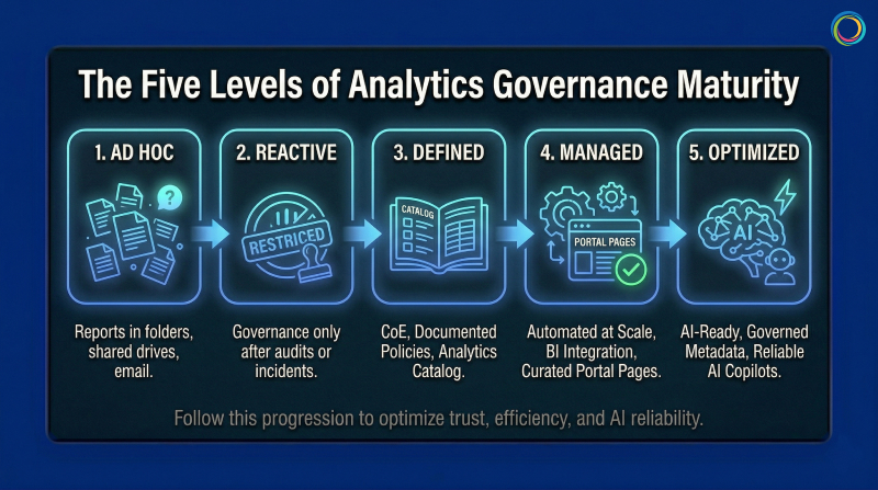
No overarching governance structure. Reports exist in personal folders, shared drives, and email inboxes. Tool sprawl is uncontrolled, with teams adopting BI tools without IT coordination. No audit trail, no access controls, no certification process. A significant portion of reports created at this level are never consumed by anyone, meaning report-building effort produces zero business value.
Tooling required: None. The first move is governance policy: defining ownership, certification criteria, and access control standards. A governance charter and RACI matrix for analytics ownership are sufficient to begin.
Typical profile: Small to mid-market, or post-acquisition with unconsolidated governance. Advancement to Level 2: 6 to 12 months.
Governance begins only after a trigger: an audit finding, a security incident, a license audit revealing unexpected costs. Processes are manual and enforcement is uneven. A governance team exists but operates reactively. Duplication detection is manual, and governance is perceived as a gate rather than an enabler.
Tooling required: Still primarily policy-driven. Organizations at this level need to define governance structure before investing in technology. Spreadsheet-based tracking works temporarily but hits scaling limits quickly, signaling readiness for Level 3.
Typical profile: Mid-market in regulated verticals (insurance carriers, pharmaceutical, financial services) post-compliance event. Advancement to Level 3: 12 to 18 months.
This is the first level that requires dedicated tooling. Governance policies are formally documented. A BI Center of Excellence or Analytics CoE owns enforcement. An Analytics Catalog inventories reports and dashboards with standardized metadata: owner, update frequency, data source, certification status.
ZenOptics Atlas serves as the analytics system of record at this stage. It connects to existing BI platforms through native connectors, cataloging every report, dashboard, and KPI across tools with certified ownership, lineage tracking, and usage visibility. Unlike data catalogs that inventory tables and schemas, Atlas catalogs the analytics assets that business users actually rely on: the dashboards, reports, and metrics that drive daily decisions.
This is where most organizations stall. Catalog maintenance is labor-intensive when metadata entry is manual. Cross-tool governance (maintaining policies across both Tableau and Power BI) requires duplicate processes that do not scale. The Level 3 to Level 4 transition demands automation.
Typical profile: Large mid-market to enterprise with compliance requirements (CPG, insurance carriers, federal). Advancement to Level 4: 18 to 24 months.
Governance is automated. Atlas integrates with all BI platforms for automatic metadata ingestion and usage tracking, eliminating the manual catalog maintenance that creates governance fatigue at Level 3. Report rationalization happens systematically: duplicates and low-value reports are identified through usage analysis and consolidated. Certified reports surface prominently through Portal Pages, department-specific landing pages that guide users directly to trusted, role-relevant content.
Three capabilities define the Level 3 to Level 4 breakthrough:
Automated metadata ingestion. Catalog entries are populated and refreshed automatically from BI platform APIs. Brown-Forman’s governance framework operates across 4,000+ users because metadata flows into Atlas from connected BI tools without manual intervention.
Usage-based rationalization. Usage tracking identifies reports that are never consumed, duplicates that create conflicting metrics, and the high-value certified content that should be promoted. Bimbo Bakeries USA’s elimination of 25 SharePoint sites across 53 bakeries was driven by usage data that made the rationalization case self-evident.
Cross-tool cost visibility. BI spend is correlated to asset-level value: what each report costs to maintain versus the business decisions it supports. This gives analytics leaders the financial language to defend governance investment.
Brown-Forman achieved a 30% report reduction and 27% analytics adoption increase year-over-year. Bimbo Bakeries USA improved report discovery time by 5 to 10% and saved approximately 5 hours per month in publishing effort.
For organizations managing Power BI at enterprise scale, see Power BI Governance at Enterprise Scale.
Typical profile: Enterprise-scale (1,000+ analytics users), post-consolidation or actively planning BI migration.
Level 5 extends governance beyond cataloging and rationalization into two domains: making analytics AI-ready and embedding governance into operational business workflows.
As organizations deploy AI copilots and conversational analytics tools, those AI systems need to understand how the organization defines and measures performance. Without governed, contextualized metadata, AI outputs are unreliable: inconsistent metric definitions, naming conflicts across departments, and unresolved aliases produce hallucinated or contradictory answers.
ZenOptics Nexus provides the analytics context layer that solves this. Nexus builds a semantic knowledge graph that maps KPIs to business concepts, resolves naming conflicts across departments, and standardizes metric definitions. Every AI query is grounded in certified, governed metric definitions rather than raw, uncontextualized data.
ZenOptics Maestro embeds governance into operational workflows. Instead of governance ending at the point of analytics consumption, Maestro turns analytics insights into governed, traceable business processes with built-in reviews, approvals, and audit trails. Its workflow library spans Finance, Legal, HR, Sales, and IT. ZIVA, the AI assistant, generates workflows from natural language. Every workflow captures decision provenance: what data informed the decision, who approved it, and what happened after.
Level 5 organizations are positioned for AI-driven analytics growth because their governance infrastructure provides the semantic context AI needs to operate accurately, and the workflow guardrails to ensure governed execution.
Typical profile: Enterprise-scale (5,000+ analytics users) with advanced analytics maturity. Level 5 is not a destination. It is a continuous operating state.
Quick Assessment
Your overall maturity level is determined by the lowest dimension, not the highest.
| Dimension | Level 1 (Ad Hoc) | Level 2 (Reactive) | Level 3 (Defined) | Level 4 (Managed) | Level 5 (Optimized) |
|---|---|---|---|---|---|
| Governance Structure | None | Reactive, spreadsheet-driven | Documented, CoE-led | Automated, cross-tool | AI-enabled, continuous |
| Catalog and Visibility | No central catalog | Partial catalog, manual | Centralized catalog, metadata complete | Automated ingestion, usage tracked | Predictive curation |
| Access Control | Fragmented, per-tool | Manual, policy-based | Standardized, manual enforcement | Automated, role-based | Intelligent, contextual |
| Cost Visibility | None | Estimated | By platform | By platform and usage | By asset ROI |
| User Adoption | Low, siloed discovery | Moderate, perceived friction | Moderate, growing | High, self-serve certified content | High, frictionless innovation |
Three diagnostic questions for quick placement: How long to produce a complete analytics asset inventory? How quickly can you respond to a compliance audit on BI access? How do you measure ROI on BI investments at the individual asset level?
For a detailed audit methodology, see How to Audit Your BI Environment Before a Migration.
Multi-site complexity (20 to 50 manufacturing plants generating independent reports across different BI tools and metric definitions) drives severe analytics sprawl. FDA inspection readiness, FSMA compliance, and financial audit requirements push CPG organizations to Level 3 faster than less regulated industries. The cost reduction dimension then accelerates Level 3 to Level 4 progression, as Brown-Forman and Bimbo Bakeries USA demonstrated through direct license savings and operational overhead reduction.
For a detailed CPG governance framework, see Analytics Governance for CPG.
Insurance carriers advance quickly to Level 3 because state insurance commissions, NAIC reporting, and SOX mandate documented governance. The Level 3 to Level 4 challenge is cultural: actuarial, claims, and underwriting teams each maintain their own analytics environments, and consolidation meets resistance. Pairing governance with self-service discovery through Atlas shifts the perception from compliance gate to productivity enabler.
FedRAMP compliance requirements, classified/unclassified environment separation, and extended procurement cycles constrain advancement. Most federal analytics environments sit at Level 2 to Level 3. ZenOptics partners with Y Point Analytics, the authorized federal reseller, and holds Federal UEI (LNJ1YFH14ZM6) and CAGE Code (8MNB5).
Data governance manages raw data quality, lineage, and metadata at the source layer. Analytics governance manages the artifacts built on top of that data: reports, dashboards, KPIs, and metrics. Both are necessary, and neither substitutes for the other. ZenOptics Atlas is an Analytics Catalog, not a Data Catalog. It inventories, certifies, and tracks analytics assets across BI tools without requiring data migration.
Atlas provides the analytics system of record required at Levels 3 and 4: cataloging, governance, connectors, usage tracking, and rationalization. Nexus adds the semantic context layer for Level 5 AI readiness: knowledge graphs, metric standardization, and AI grounding. Maestro extends governance into operational workflows: governed business processes, decision provenance, and AI-assisted workflow creation through ZIVA.
Across four dimensions: trust and adoption (certified content consumption, time-to-discovery), cost reduction (license savings from rationalization, compute savings from retiring unused reports), risk reduction (audit readiness, reduction in findings), and productivity (time saved in report discovery, faster onboarding). Brown-Forman’s 30% report reduction and 27% adoption increase, and Bimbo Bakeries USA’s 5 hours per month saved and 25 eliminated SharePoint sites, are examples of measurable governance ROI.
Your company runs Power BI on Azure, Tableau on AWS, and has a legacy SAP BusinessObjects instance that nobody wants to touch. Each platform has its own governance approach, its own certification process, and its own definition of what “revenue” means.
Welcome to multi-cloud reality. Gartner predicts that 90% of organizations will adopt a hybrid cloud approach through 2027. They are responding to real business needs: regional compliance, best-of-breed tools, M&A integration, and teams that prefer different platforms. Multi-cloud is not going away.
The challenge is governance. Traditional approaches assume centralization. But you cannot force distributed analytics into a single system without massive migration projects that rarely finish. Federated Analytics Governance offers an alternative: apply consistent policies across distributed environments while respecting local autonomy.
For organizations building data trust frameworks, federated governance is how trust scales across distributed environments.
Traditional data governance emerged when analytics lived in one warehouse accessed through one reporting tool. Governance meant controlling that single bottleneck. Simple. Effective. And increasingly irrelevant.
McKinsey research shows that more than 95% of enterprise organizations now have a cloud footprint, with workloads in the public cloud increasing from 32% in 2018 to 52% in 2025. When different business units deploy different BI tools on different clouds, each creates its own reporting ecosystem with parallel dashboards, reports, and KPIs. This BI Sprawl is not a bug. It is a feature of how modern enterprises actually operate.
Gartner predicts that 80% of data governance initiatives will fail by 2027 without proper change management. Much of that failure stems from governance approaches designed for centralized environments that no longer exist.
Most governance also stops at the data layer. But business users do not query databases. They open reports and dashboards. Gartner warns that organizations can no longer implicitly trust data, predicting 50% will adopt zero-trust data governance by 2028. Part of this Data Trust Gap exists because governance never reaches the consumption layer where trust needs to be visible.
Federated Governance separates policy from execution. The enterprise defines standards for certification, quality, and access. Local teams implement those standards within their chosen platforms. Think of it like franchise operations. The parent company defines brand standards and quality requirements. Individual franchises execute within those standards using local resources. You get consistency without requiring every location to be identical.
The model operates across three layers. The policy layer defines enterprise-wide standards that apply regardless of platform: certification criteria, naming conventions, metric definitions, and lifecycle rules. Policy expresses requirements in terms of outcomes, not specific implementations. The orchestration layer coordinates governance across platforms through cross-platform discovery, unified monitoring, and centralized reporting that gives leadership visibility into governance health enterprise-wide. The execution layer implements governance within each platform. Teams use native tools to apply enterprise policies. They certify reports using Tableau’s capabilities or Power BI’s workflows. Execution stays local, but the standards are enterprise-wide.
Central ownership includes metric definitions, certification standards, compliance requirements, and cross-platform visibility. Distributed ownership includes report development, platform administration, certification execution, and local user support. Drawing this boundary deliberately prevents political negotiation or technical constraints from determining what should be strategic decisions.
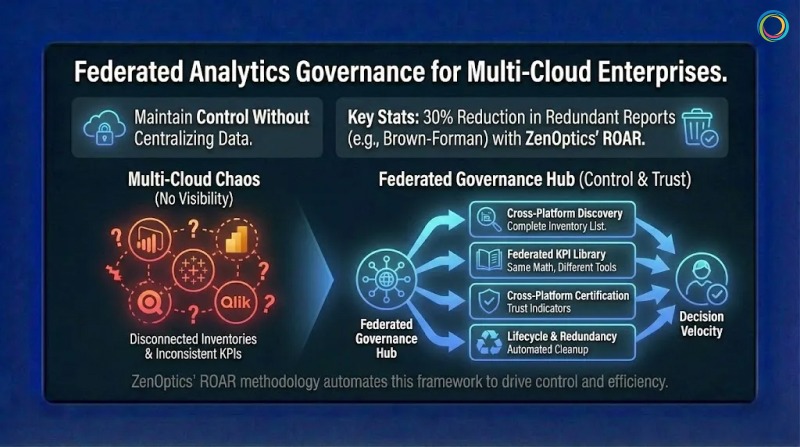
You cannot govern what you cannot see. Most enterprises lack a complete inventory of reports across platforms. Assets accumulate over years with inconsistent naming and documentation gaps. Cross-platform discovery requires connecting to each BI tool and extracting metadata about what exists, who owns it, and how frequently people use it. This inventory becomes the foundation for everything else.
When “customer count” means different things in Power BI and Tableau, every cross-platform comparison becomes an argument. A federated KPI Library defines enterprise-wide metric standards that all platforms reference, ensuring calculation consistency while allowing documented local variations. Same terms. Same math. Different tools.
Enterprise standards define what certified reports require: documented owners, accuracy validation, scheduled refreshes, approved data sources. Platform teams implement certification using native capabilities. Cross-platform visibility then aggregates certification status so users see trust indicators regardless of which platform contains each report. This connects directly to decision velocity. When users can quickly identify trustworthy reports across all platforms, they spend less time validating and more time deciding.
Reports accumulate without active management. Federated lifecycle governance applies consistent policies across platforms: review schedules, recertification triggers, and archival rules. Cross-platform redundancy detection identifies duplicates across tools. ZenOptics’ ROAR methodology automates this analysis, with customers like Brown-Forman achieving 30% reduction in redundant reports.
Federated governance requires technology that connects across platforms without creating new vendor lock-in. Unified discovery connects to multiple BI tools and aggregates metadata into consolidated inventories that update automatically. Cross-platform search lets users find assets without knowing which platform contains them, then access reports with one click in their native environment. Governance dashboards aggregate compliance metrics across all connected platforms, surfacing trends and exceptions that require attention.
The ZenOptics Analytics Hub provides this foundation through 100+ smart connectors integrating Power BI, Tableau, Qlik, SAP BusinessObjects, and other platforms. The unified BI Portal architecture creates a single interface layer while preserving native report formatting and user experience.
Federated governance applies consistent enterprise policies across distributed analytics without requiring centralization. The enterprise defines standards. Local teams implement them within their platforms. This provides consistency across multi-cloud environments while respecting legitimate reasons for different tool choices.
Centralized governance assumes a single access path you can control. Federated governance separates policy from execution: central teams own standards and visibility, distributed teams own development and administration.
You need cross-platform connectors that create unified inventories, search interfaces that work across tools, and governance dashboards that aggregate metrics enterprise-wide. The technology must be platform-neutral to avoid creating lock-in.
Multi-Cloud is not going away. The majority of enterprises operating across multiple clouds are responding to real requirements that centralization cannot address.
Governance must adapt. Define enterprise standards for what trusted analytics look like. Let platform teams implement those standards within their chosen tools. Create cross-platform visibility so governance operates across the full ecosystem.
For enterprises managing analytics across multiple clouds and platforms, federated governance is the only model that matches how their analytics actually work.
Your company spent six figures on a new BI platform. Two years later, the same five analysts use it while everyone else still emails them for reports.
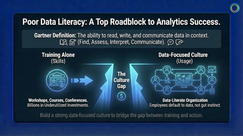
Sound familiar? Gartner’s 2024 CDAO Survey found that poor Data Literacy ranks among the top five roadblocks to data and analytics success. Leaders say data literacy is critical, yet most organizations have not achieved it. That gap represents billions in underutilized analytics investments sitting idle while teams default to gut instinct.
The problem is not training budgets. Companies run workshops, buy courses, and send employees to conferences. But training alone does not create a data-literate organization. Training teaches skills. Culture determines whether those skills get used.
This is where most initiatives fail. For organizations working on data trust frameworks, literacy is what turns trustworthy data into confident action.
Most organizations treat data literacy like a compliance checkbox. They assign courses, track completion rates, and call it done. Six months later, nothing has changed. The same analysts answer the same questions for the same business users who never opened the tools they were trained on.
Gartner research identifies three categories of challenges: executive sponsorship issues (lack of ownership or budget), learning experience problems (unengaging training), and cultural barriers (employee resistance). Only one of these is actually about training itself.
Another failure mode is teaching generic skills disconnected from actual work. A finance analyst needs different skills than a supply chain manager. Generic training treats everyone the same, which means it works well for no one. The biggest failure is launching initiatives without explaining why they matter. Without understanding the purpose, employees complete minimum requirements and return to working how they always have.
Gartner defines Data Literacy as “the ability to read, write, and communicate data in context.” In practice, it means employees can find relevant information, assess whether it is trustworthy, interpret what it means, and communicate conclusions that support good decisions. Piyanka Jain, CEO of Aryng, puts it well: “It’s not about turning everyone into a data scientist. It’s about enabling employees to deliver measurable business value using data.”
Not everyone needs the same level of capability. Basic literacy means finding reports and understanding visualizations. Working literacy means asking good questions, interpreting trends, and knowing when to seek expert help. Advanced literacy means designing analyses and creating visualizations. Targeting the right level prevents under-investment (leaving people unable to do jobs) and over-investment (teaching unused skills).
Here is what many organizations miss entirely. Data Literacy without Data Trust creates frustration. Research from Precisely found 67% of organizations do not trust their data. Teaching people to use data they do not trust is like teaching someone to drive a car with broken brakes. Literacy programs work best alongside trust-building initiatives like data trust scoring.
Effective programs begin with job tasks rather than software features. Instead of teaching “how to use Power BI,” they teach “how to answer questions your job requires.” This distinction matters more than most training teams realize.
Brown-Forman surveyed internal customers about analytics adoption. They found people wanted easier access to relevant analytics, not more training. Their solution was a one-stop shop putting the right reports in front of the right people. Adoption improved because the barrier was access, not skill. Sometimes the problem looks like literacy but is actually discovery.
Adults learn by doing. After learning a concept, employees should use it immediately on something that matters. Harvard Data Science Review’s 2025 research shows organizations with mature literacy programs treat training as ongoing practice, not one-time events. Middle managers serve as the primary execution arm of data strategy, turning vision into daily practice.
Culture change happens through modeling, not mandates. When executives ask for data before decisions, they signal that data matters. When leaders share how data changed their thinking, they give permission for others to do the same. Leadership goes first or the initiative stalls.
Gartner predicts more than 50% of CDAOs will secure funding for data literacy programs by 2027. But this requires visible commitment from business leadership, not just technology leadership. CDAOs cannot build culture alone.
People take the path of least resistance. If finding a report requires checking four systems with different passwords, people rely on memory instead. Self-service platforms reduce dependency on specialists. Analytics hubs that unify discovery across BI tools eliminate search burdens. The goal is making data-informed decisions easier than uninformed ones.
Fear of looking stupid kills literacy faster than any skill gap. Leaders should normalize not knowing everything. Teams should celebrate good questions, not just answers. What gets measured gets managed. Define specific, observable behaviors: Did the manager reference metrics in team meetings? Did the sales rep use pipeline data to prioritize accounts? Recognition for data-informed decisions creates social proof that literacy leads to success.
The ZenOptics Analytics Hub creates an environment where using data is easy and finding trusted information is straightforward. Self-service discovery puts reports from all connected BI platforms into a single searchable interface. Business users find what they need without knowing which system contains it.
Trust Indicators display certification status, freshness, and ownership. Users quickly assess whether information is reliable, building confidence to act. Collaboration features connect comments and ratings directly to reports. Users learn from each other through shared annotations and can find experts when needed. Curated portals present role-relevant content so employees land on information that matters rather than searching through everything.
Data literacy is the ability to find, interpret, and communicate data in context. It enables employees to engage with evidence rather than relying solely on specialists.
They focus on skill transfer without addressing culture, access, and motivation. Without supportive environments, skills fade unused.
Look at behavior change: self-service usage rates, reduction in support requests, data references in decision documentation. The ultimate measure is improved business outcomes.
Data Literacy is not a training problem. It is a culture problem that training alone cannot solve.
Successful organizations teach skills in context, create environments where data is easy to use, remove friction through accessible platforms, and model data-informed behavior from leadership down. Your BI platform is only as valuable as the number of people who confidently use it.
Data literacy turns expensive infrastructure into competitive advantage. The question is whether your organization builds the culture to unlock it.
While your team spends twenty minutes searching for the right sales report, a competitor may already have made their pricing decision and moved on.
That gap matters more than most leaders realize. McKinsey research shows that only 37% of executives believe their organizations make decisions that are both high-quality and fast. Most organizations end up trading speed for confidence, confidence for speed or losing both.
Organizations that consistently move quickly from question to confident action outperform peers. They respond faster to market shifts, identify risks earlier, and close opportunities more effectively. The difference is rarely about working harder or generating more dashboards. It is about removing friction between having analytics and acting on them.
This is where Decision Velocity becomes critical. For organizations investing in analytics trust and governance, decision velocity is where those investments translate into measurable business outcomes.
Decision velocity measures the time between asking a business question and taking confident action. It spans multiple steps:
Each step introduces friction. Each delay compounds cost.
McKinsey estimates that managers at large enterprises collectively lose hundreds of thousands of days annually due to ineffective decision processes translating into hundreds of millions of dollars in lost productivity. Importantly, speed and quality are not opposites. McKinsey has found a strong positive correlation between decision speed and decision quality.
Organizations that decide quickly also tend to decide well because the same capabilities enable both:
Business users spend a disproportionate amount of time simply finding analytics. Internal ZenOptics research indicates that employees can spend up to 25% of their time searching for reports across disconnected BI systems before analysis even begins.
Analytics sprawl magnifies the problem. As teams deploy new dashboards and tools independently, asset volume grows while discoverability declines. Under pressure, users often rebuild reports instead of locating existing ones, reinforcing duplication and inconsistency.
The impact is rarely isolated. A delayed analytics insight in one area cascades into operational delays elsewhere, pushing back decisions, compressing execution windows, and increasing risk.
Persistent access friction also erodes trust. When teams repeatedly struggle to find or validate analytics, they resort to workarounds: shadow spreadsheets, offline exports, and intuition-driven decisions. Industry research shows that a majority of organizations continue to struggle with trusting analytics for decision-making, a gap driven as much by visibility and access as by data quality itself.
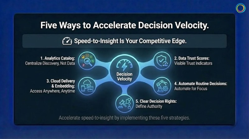
1. Centralize discovery without centralizing data
You don’t need to move all analytics into one system. You need one place where users can discover analytics across systems. An analytics catalog provides a unified search experience across platforms like Tableau, Power BI, and others, reducing time spent hunting for information without disrupting existing tools.
2. Make trust visible at the point of use
Finding a report is only half the battle. Users still need to know whether it is current, accurate, and appropriate for their decision. Visible trust indicators, such as certification status, freshness signals, and ownership, allow users to assess fitness quickly without manual validation.
3. Bring analytics into decision workflows
Decision velocity improves when analytics appear where work happens, not in separate tools. Cloud delivery and embedded analytics reduce context-switching by placing insights directly into operational systems such as CRM or ERP environments.
4. Automate routine decisions where appropriate
Not every decision requires human intervention. Routine activities such as threshold alerts, exception detection, or replenishment triggers can be partially automated. Automation reduces noise and frees teams to focus on higher-value decisions that require judgment.
5. Clarify decision ownership
Technical improvements alone cannot fix organizational ambiguity. When decision rights are unclear, analytics stall in approval loops. Clearly defining who can decide what enables faster action without sacrificing accountability.
ZenOptics directly addresses the discovery and validation bottlenecks that slow decisions.
Unified discovery provides a single interface to find analytics assets across BI platforms, eliminating the fragmentation that consumes productive hours. Trust indicators surface certification status, ownership, usage context, and freshness, helping users move from discovery to action with confidence.
By connecting analytics to governance context and operational workflows, ZenOptics reduces the friction that turns insights into delays. For enterprises managing analytics at scale, this transforms decision velocity from an aspiration into a repeatable capability.
What does decision velocity mean?
Decision velocity measures how quickly an organization moves from identifying a question to taking action based on trusted analytics.
How much does slow decision-making cost?
Industry research estimates that ineffective decision processes cost large enterprises hundreds of millions of dollars annually in lost productivity.
Do faster decisions mean worse decisions?
No. Research consistently shows that organizations with high decision velocity also achieve higher decision quality, because clarity, trust, and access improve both.
Decision velocity separates organizations that lead from those that react.
Improving it requires reducing friction across the decision lifecycle: discovering analytics quickly, validating them confidently, and accessing them where decisions are made. Centralized discovery, visible trust signals, contextual access, selective automation, and clear decision rights work together to accelerate outcomes.
Your competitors are already optimizing for speed and confidence. The question is how much ground is lost while waiting.
The paradox of modern analytics is getting harder to ignore. Organizations keep investing more in governance, yet trust in analytics stays stubbornly low.
Gartner research reveals that poor data quality costs organizations an average of $12.9 million per year. Meanwhile, Gartner also predicts that by 2028, 50% of organizations will implement zero-trust data governance because they can no longer implicitly trust their data. More investment in governance. Less confidence in outcomes. Something is clearly misaligned.
The disconnect is not mysterious. Traditional governance efforts tend to stop at the data warehouse or pipeline. They rarely extend to the consumption layer, where business users actually interact with reports, dashboards, and KPIs. Organizations can have well-governed data tables while the analytics built on top of them remain fragmented, duplicated, or poorly understood. This is the core challenge behind what we call the Data Trust Gap.
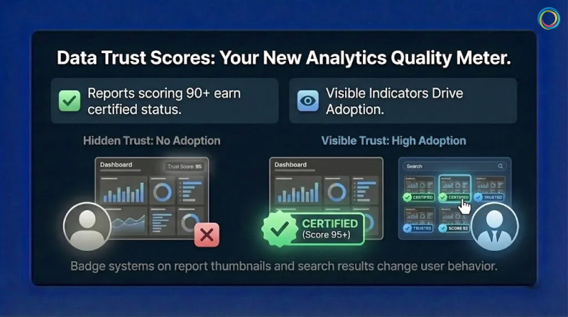
This is where Data Trust Scores play a role. Not as a universal standard, but as a practical framework for surfacing trust signals at the point of decision-making. A trust score helps teams assess how reliable a specific report or dashboard is for use, complementing data quality efforts with visibility into analytics consumption.
A data trust score works like a credit score for analytics assets. It combines multiple signals into a single, interpretable view that helps users gauge risk before acting on a report or dashboard.
Gartner’s data governance framework defines core data quality dimensions at the data layer: accuracy, completeness, consistency, timeliness, validity, and uniqueness. At the analytics consumption layer, trust assessment extends beyond these technical metrics to include additional context:
Accuracy and consistency: Do reported metrics align across tools and teams?
Freshness: Is the data current enough for its intended decision?
Completeness: Are key dimensions and filters populated?
Ownership: Is there a clearly accountable owner?
Certification status: Has the asset been reviewed and approved through proper certification workflows?
Usage signals: Is the asset actively referenced or consistently avoided?
Usage alone does not equal trust. Some reports are niche or infrequently used by design. But when usage patterns are evaluated alongside quality, ownership, and certification signals, they provide meaningful insight into an asset’s relevance and reliability over time.
The financial stakes are significant. Industry research shows that many organizations still do not consistently measure data quality, contributing to millions in annual losses from rework, validation, and delayed decisions. When analytics are not trusted, teams manually verify numbers, create shadow dashboards, and slow decision cycles while seeking confirmation. This is BI Sprawl in action.
There is no universal formula for data trust scores. And there shouldn’t be. Effective trust models reflect an organization’s specific decision context and risk tolerance.
Many organizations begin with weighted scoring models that combine multiple signals. An illustrative example might include:
These weights are directional examples, not prescriptive best practices. What matters more than the exact math is transparency. Users should understand why an asset has a particular trust level and what actions would improve it.
Clear thresholds also matter. Some organizations define ranges such as:
Visual indicators like badges and color coding help users interpret trust quickly without needing to analyze scores in detail. This approach aligns with building a true Single Source of Truth for enterprise analytics.
One common mistake is calculating trust scores but hiding them. Trust indicators that users cannot see do not change behavior. Visibility in search results, asset thumbnails, and detail panels drives adoption and accountability.
Automated scoring alone is not governance. Certification introduces human judgment into the trust process.
A typical certification workflow includes:
Certification should be continuous, not permanent. Assets should be re-evaluated based on:
Every report or dashboard should have a clearly designated owner. When ownership is explicit, accountability follows. Owners receive notifications when assets degrade and are responsible for remediation or recertification. This creates incentives for quality that static governance policies rarely achieve.
Effective Analytics Governance builds these workflows directly into the user experience, making certification visible and actionable.
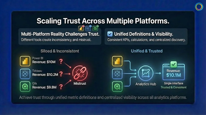
Most enterprises operate across multiple BI platforms: Power BI, Tableau, Qlik, and others. Each platform defines governance and quality differently, which makes trust difficult to compare at scale.
Gartner research indicates that organizations with multiple BI tools face increased complexity in maintaining consistent data definitions and governance standards.
Effective multi-platform trust requires:
Unified metric definitions so KPIs mean the same thing everywhere
Consistent trust signals applied across platforms
Centralized visibility into analytics assets through an Analytics Catalog
This does not require replacing existing tools. It requires a shared analytics context layer that enables comparison and clarity while allowing teams to continue working in their preferred platforms.
The goal is cross-platform visibility that eliminates Report Sprawl and surfaces trust signals regardless of where assets live.
ZenOptics does not impose a rigid scoring standard or black-box algorithm. Instead, it provides the analytics context and infrastructure needed to surface trust signals consistently across BI environments.
With ZenOptics, organizations can:
By making trust signals visible and actionable, ZenOptics helps teams move from reactive governance to confidence-driven analytics consumption.
A data trust score is a directional indicator that summarizes multiple quality, governance, and usage signals to help users assess whether an analytics asset is reliable for decision-making.
Organizations typically combine weighted signals such as accuracy, freshness, completeness, ownership, certification, and usage. The specific model varies based on context and risk tolerance.
Data quality focuses on raw data accuracy and integrity at the data layer. Data trust extends to the analytics layer, evaluating the reports and dashboards people rely on to make decisions. This distinction is why traditional Data Catalogs alone cannot solve the trust problem.
The primary cause is that governance stops at the data layer. Business users do not query databases directly. They open reports and dashboards. When governance never reaches this consumption layer, the Data Trust Gap persists regardless of underlying data quality.
Data trust is not about governing databases. It is about governing the analytics people actually use.
By surfacing trust signals, making certification visible, and creating clear ownership, organizations reduce validation waste, eliminate redundant shadow reports, and accelerate decision-making.
Data trust scores do not replace judgment. They support it. And in complex analytics environments, that support makes all the difference.
Ready to build trust in your analytics?
Request a demo to see how ZenOptics can help your organization establish confidence in enterprise analytics.
In the on-premise era, hoarding data was cheap. In the cloud era, it is a liability.
Every time you migrate a Tableau workbook or a Power BI report to the cloud, the meter starts running. You pay for storage, for compute power during refresh cycles, and for backup instances. Yet, a massive portion of this spend is wasted. According to ZenOptics enterprise analysis across Fortune 500 deployments, 38% of reports are never viewed, and 32% are duplicates.
These are “Zombie Reports” (officially classified as stale reports in your ecosystem). They haven’t been opened in over six months, yet they continue to consume licenses, engineer hours, and infrastructure budget. This bloat inflates your Total Cost of Ownership (TCO), and for a typical enterprise, it is costing nearly half a million dollars a year.
→ Related: Tableau Sprawl Is Costing You Twice: Why Dashboard Chaos Kills Both Trust and Cloud Budgets
You might think, ‘Storage is cheap, so why does it matter?’ But the Total Cost of Ownership (TCO) of a report is far more than just disk space.
Based on a typical enterprise model with 10,000 reports and 800 active licenses, the annual “maintenance bill” for the bi dashboards estate is approximately $1.07 million.
Here is where the waste hides:
Compute Costs (~$52k/month): Every zombie report that is scheduled to auto-refresh is burning CPU cycles you pay for.
Licensing Leakage (~$15k/month): You are often paying for expensive ‘Creator’ or ‘Explorer’ licenses for users who only consume static content or, worse, haven’t logged in for months.
Maintenance & Support (~$22.5k/month): Your data engineers spend hours troubleshooting failures on reports that nobody reads.
This aligns with Everest Group’s 2024 research, which found that 67% of organizations experienced higher-than-expected cloud costs, with 82% of global organizations reporting that at least 10% of their cloud spend is wasted.
When your users cannot find what they need, they create duplicates, compounding the trust gap and driving more wasted spend.
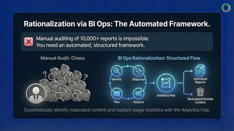
You cannot manually audit 10,000 reports to find the zombie reports. You need an automated, structured framework. This is the Analytics Ops (or BI Ops) methodology.
To reclaim your budget, follow the Identify > Diagnose > Analyze > Plan cycle:
Stop guessing. Deploy connectors to crawl your BI platforms (Tableau, Power BI, Qlik, etc.). This automatically builds an inventory and captures usage statistics.
What to look for: Reports with zero views in the last 180 days.
Use metadata analysis to detect redundancy.
The “Kill List”: Identify stale reports (zombie reports) and duplicate reports (e.g., ‘Sales_v1’ vs. ‘Sales_Final’).
Modern self service analytics environments often grow unchecked. Without automated detection, the same report gets recreated multiple times as users cannot find existing assets. This dashboard fatigue drives redundancy that inflates your BI spend.
Safely retire the unused assets. This immediately reduces your cloud footprint and frees up licenses.
The Result: A cleaner environment where search actually works, and a budget that is optimized for innovation rather than maintenance.
A global Fortune 500 manufacturer faced a challenge familiar to many large enterprises: an unmanageable reporting environment with no way to evaluate relevance, freshness, or reliability across thousands of assets.
The Challenge: The organization had accumulated over 10,000 reports across their ecosystem, with no systematic way to identify which reports were critical, which were duplicates, and which were no longer relevant.
The BI Ops Approach: They implemented the ZenOptics Analytics Hub to crawl their entire BI landscape, capture usage statistics, and systematically identify redundant content.
The Results:
Brown-Forman, the global spirits company behind Jack Daniel’s, achieved similar results with their analytics rationalization initiative:
“ZenOptics has helped us solve our distributed reporting challenges and improve collaboration throughout our organization.”
— Sam Sorsa, Senior Director of Finance, Brown-Forman
Every dollar you spend maintaining a zombie report is a dollar you cannot spend on AI or predictive analytics. With Gartner forecasting global public cloud spending to reach $723 billion by 2025, the stakes of cloud waste have never been higher.
Report Rationalization is not just a housekeeping task; it is a financial imperative. By identifying stale content and eliminating duplicates, you can slash your TCO by 40% and turn your analytics budget into an investment, not a tax.
You have successfully democratized data. Your teams have access to Tableau for visual analytics, Power BI for operational reporting, and perhaps a legacy layer of Qlik, Cognos, or SAP. But instead of empowering users, this abundance has created a new form of friction: Dashboard Fatigue.
Users are overwhelmed and to get a complete view of the business, a sales executive might have to log in to Salesforce for pipeline data, swivel to Tableau for regional visualizations, and then hunt through SharePoint for a Word doc or PDF strategy memo. This “swivel-chair” experience is a productivity killer that compounds with every additional BI tool you add to your stack.
According to Gartner, 47% of digital workers struggle to find the information or data needed to effectively perform their jobs. The same research found that knowledge workers now use an average of 11 applications daily – nearly double the six applications typical in 2019. This report sprawl is inconvenient, and measurable productivity loss.
When finding data is harder than using it, adoption plummets. Users stop logging in. They revert to emailing their favorite analyst for a static export, and your expensive BI investment becomes shelfware.
The root cause of low adoption is not usually the quality of the dashboard; it’s the analytics consumption experience of the delivery mechanism.
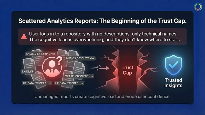
Contrary to the intent, most BI platforms get optimized for authors, not consumers. They organize content in technical hierarchies or massive lists. This logic makes sense to the data engineer who built it, but it is a maze for the business user who just wants “My Weekly Numbers.”
When a user logs in and encounters a large repository of reports with no descriptions or context, just the technical name of the dashboard, they experience cognitive load. They don’t know where to even start.
This is where the trust gap begins. When users cannot easily find certified, validated bi dashboards, they lose confidence in the entire analytics ecosystem. The problem isn’t data quality – it’s the delivery layer creating friction between users and insights.
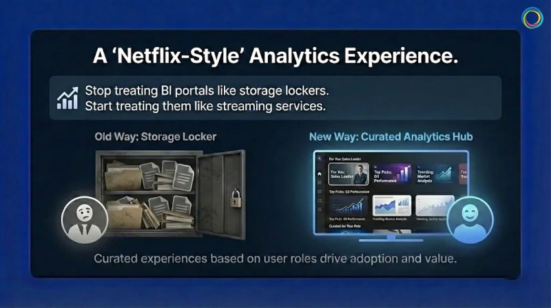
If we want analytics adoption to grow, we have to stop treating BI portals like storage lockers and start treating them like streaming services.
Netflix doesn’t dump every movie in front of you when you log in – and analytics shouldn’t either. The experience should be curated based on the user’s role.
That’s how self-service analytics moves from “hunt and search” to “discover and consume.”
First, eliminate the swivel chair. A Unified Analytics Hub aggregates metadata from all your systems – Tableau, Power BI, Qlik, Excel—into a single interface.
A user searches for ‘Gross Margin’ and sees the certified and approved Tableau dashboard and the related PDF commentary side-by-side. No more hopping between tabs.
By bringing all analytics assets into one searchable interface, you reduce thecost of zombie reports by making existing content discoverable before users request duplicates.
Move away from complex navigation. Use Portal Pages to create role-based landing zones.
The Strategy: An executive logging in should see a curated page featuring their ‘Top 5 KPIs,’ a ‘Quarterly Forecast’ widget, and a news feed of recent analyst commentary.
The Benefit: The user sees only what matters to them immediately. This reduces noise and guides attention to the highest-value assets.
Leverage usage data to drive discovery.
The Strategy: Show users ‘Trending’ reports or ‘Recommended for You’ based on what their peers in the Finance department are viewing.
The Benefit: This passive discovery helps users find insights they didn’t even know they were looking for, keeping them engaged with the platform.
Brown-Forman, the global company behind brands like Jack Daniel’s and Woodford Reserve, faced a classic case of fragmentation, not just of reports and dashboards but also of multiple portals. Their landscape included multiple portals, each housing SAP, Tableau, Salesforce, and Google Sheets, leading to a disconnected experience that hindered decision-making.
They didn’t want just another tool; they needed a ‘One-Stop Shop’ to glue their ecosystem together. They deployed the ZenOptics Analytics Hub to unify access. Instead of forcing users to remember five different logins, they provided a Single Point of Access for all analytics assets.
Brown-Forman achieved a 27% increase in user adoption of their analytics tools year over year by simplifying the “last mile” of analytics delivery. With 4,000+ users now unified under a single platform, teams focus on analysis rather than retrieval.
ZenOptics has helped us solve our distributed reporting challenges and improve collaboration throughout our organization.
– Sam Sorsa, Senior Director of Finance, Brown-Forman
To make users love your data, you have to respect their time. No executive wants to wrestle with complex source systems or multiple logins.
Studies show knowledge workers lose at least 2 to 3 hours each week searching for information. Personalized analytics discovery goes straight after this waste.
When you unify tools and curate the experience around the user, your BI platform becomes a menu, not a maze – eliminating friction and unlocking the full ROI of your data investment.
You have delivered the dashboard. It is beautiful, real-time, and built on a modern data and analytics stack. Yet, your executive team still starts every meeting with the same question: “Where did this number come from?”
This is the Trust Gap. It is the distance between the data you provide and the confidence your stakeholders have in using it.
According to the 2025 Data Integrity Trends and Insights report by Precisely and Drexel University, 67% of organizations don’t completely trust their data for decision-making, up from 55% just one year prior. They didn’t lack data, but they lacked certainty.
When executives cannot instantly verify the provenance of a KPI, they do not “trust but verify.” They simply ignore it. They revert to static spreadsheets and offline modes, creating a cycle of shadow IT that further erodes the integrity of your analytics. Gartner research confirms this pattern: 69% of employees have intentionally bypassed cybersecurity controls, often using unauthorized tools when they don’t trust official systems.
→ Related: Tableau Sprawl Is Costing You Twice: Why Dashboard Chaos Kills Both Trust and Cloud Budgets
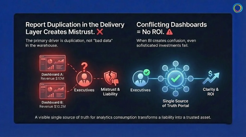
The primary driver of this mistrust is not usually “bad data” in the warehouse; it is report duplication in the delivery and consumption layer.
In a typical enterprise, it is common to find dozens of reports with nearly identical names like Sales_v1, Sales_Final, Q3_Sales_Update. When a VP searches for “Revenue” and finds 15 conflicting versions, they experience data dissonance.
If Dashboard A says revenue is $10M and Dashboard B says $10.2M (due to a different refresh cycle or filter logic), the executive assumes both are wrong. Without a visible single source of truth for analytics consumption, the platform is viewed as a liability, not an asset.
A 2025 Salesforce survey found that less than half of business leaders say their data strategies fully align with business priorities – a significant decline since 2023. When your BI dashboards create confusion rather than clarity, even the most sophisticated analytics investment fails to deliver ROI.
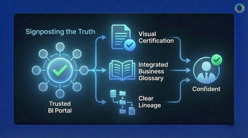
Traditional governance attempts to solve this by restricting who can build reports. This fails because it stifles agility. The modern approach (BI Ops) focuses on signposting the truth rather than hiding the noise.
To bridge the Trust Gap, you must implement three visible signals of authority within your BI portal:
1. Visual Certification (The “Blue Checkmark” for BI)
Your users are trained by consumer apps to look for verification symbols. Your self service analytics or BI portal should work the same way.
The Strategy: Implement a strict governance and certification workflow where only validated, business -approved assets receive a “Certified” watermark, not just data stewards.
The Outcome: When a user searches for a report, they can instantly filter out the noise and click the asset that is stamped as the corporate record. This eliminates the “which one is right?” guessing game.
2. Integrated Business Glossary
Numbers without context are dangerous. If a report lists “Churn Rate,” does that include involuntary cancellations?
The Strategy: Link your BI glossary directly to the report metadata.
The Outcome: A user can hover over a term and see the approved corporate definition, the owner of the metric, and the calculation logic. This transparency builds confidence that the metric is standardized, not ad-hoc.
3. Clear Lineage
Trust requires traceability.
The Strategy: Show the user the journey of the data.
The Outcome: When an executive sees that a dashboard is fed directly from the “Gold” layer of the data warehouse and was refreshed 5 minutes ago, they stop asking, “Where did this come from?”
One of the world’s leading bakery product companies faced a challenge familiar to many large enterprises: a complex reporting environment characterized by scattered assets and a lack of trust in data insights.
Leadership identified that users were overwhelmed by information and skeptical of the metrics presented. They didn’t need more reports; they needed clarity.
The “One Stop” Strategy: This company deployed the ZenOptics Analytics Hub to create a branded “One Stop” shop for enterprise data. Instead of fighting report sprawl with restrictions, they used the platform to:
The Result: By funneling users through a governed, certified layer, they established a culture where “One Stop” became the definitive source of truth. They effectively mitigated the risk of shadow IT and ensured that strategic decisions were based on governed, reliable data.
Trust is not a soft skill; it is an engineered outcome. You build it by removing friction and adding clear signals of validity.
If you want executives to believe your dashboards, you must stop asking them to hunt for the truth. Certify your best assets, define your terms, and make the “source of truth” obvious. When you do that, you don’t just get more dashboard views – you get a data-driven culture.


